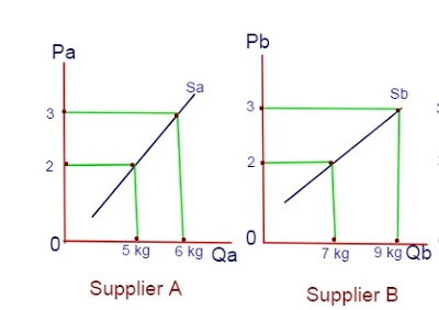
Individual and Market supply curves:
Individual supply curves:
The individual supply curve represents the quantity of a good that a supplier will want to sell at a given price, holding all else constant. For example, supplier A might sell 5 kg apples at RS. 2 per kg, 6 kgs at Rs. 3, while supplier B might sell 7 kgs at Rs. 2 per kg and 9 kg at Rs 3.When charted on a graph with price on the vertical axis and quantity sold on the horizontal axis, these points form the individual supply curves for suppliers A and B.
Market supply curve:
The market supply curve is the sum of all the individual supply curves in the market. If the entire market consisted of only the two suppliers mentioned above, the total supply for apples at a price of Rs 2 would be 12 kgs, because A would sell 5 kg and B would sell 7 kgs. At a price Rs 3, the market supply would be 15 kg apples, summing A's 6 kg and B's 9 kg.For a single good, adding all the individual supply curves of the millions of suppliers in the market makes the total market supply curve.


0 Comments
If this article has helped you, please leave a comment.